
Magic Lens Photo Media · Real Estate Media
Photo editing should help a viewer read the property clearly. A room that is too dark, a noticeable color cast or leaning architectural lines can interfere with that job. Correcting those problems still requires restraint: the finished image should describe the home someone can visit.
The most useful review separates exposure, color, geometry and consistency. A request to “make it look more luxurious” is too vague to establish what should change or what must remain faithful to the property.
Start with exposure and readable detail
A well-balanced photograph lets the viewer understand the room’s main surfaces and important features. That does not require every shadow to be lifted equally. Some shading gives the room depth and helps explain the shape of cabinetry, furniture and walls.
Windows deserve particular care. A bright opening may need more controlled capture or processing, but a darker window is not automatically a better window. The exterior view must belong to the room. For more on combining exposures, read the HDR photography guide.
Keep color coherent across the gallery
Daylight and installed lighting can create different color impressions within the same room. Review the appearance of surfaces you know: the wall, cabinets, flooring and countertop. Look for distracting casts and for unexplained changes between neighboring photographs.
Color correction should not turn one finish into another. If the cabinet color is a selling detail, provide a reliable reference and describe the mismatch precisely. Avoid applying a social filter that changes the entire gallery after delivery.
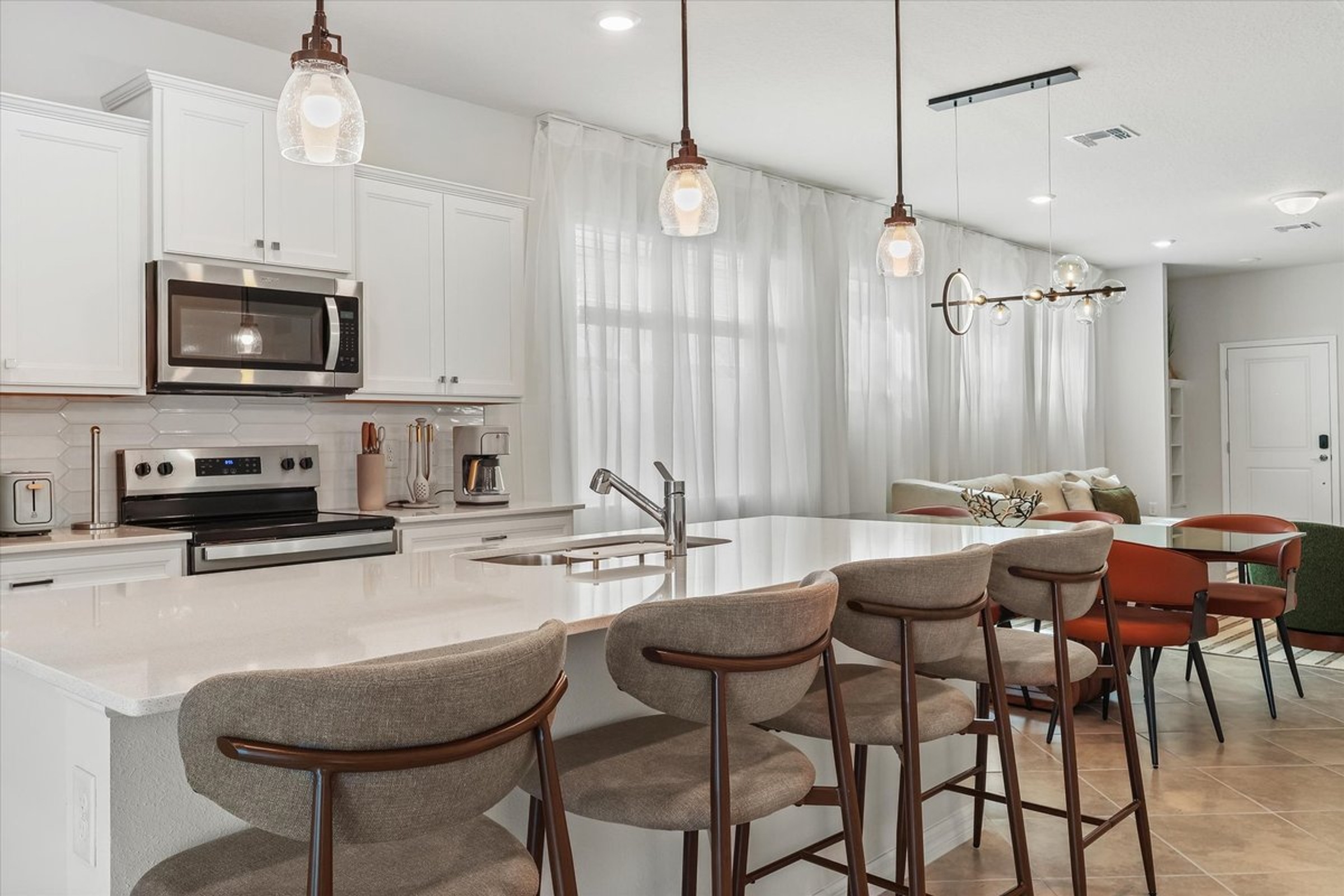
The kitchen image below is a finished Magic Lens portfolio photograph. Use it to inspect room readability and the relationship between surfaces. No unedited source is shown here, so this is not a before-and-after comparison or a claim about the editing steps used for this particular file.
Correct perspective without stretching the room
Architectural verticals are a useful reference when assessing whether an image feels stable. Door frames and wall edges that visibly lean can distract from a room. Perspective correction and a thoughtful crop may improve the presentation, but they should be judged against the whole image.
Check nearby furniture as well as the lines. A corrected wall does not justify making a chair or doorway look implausibly wide. When the original camera position creates a severe problem, a different source frame—or another photograph—may be a better answer than stronger correction.
Separate temporary preparation from property alteration
The cleanest way to address ordinary clutter is to prepare the room before photography. Move routine personal items, organize surfaces and arrange furniture appropriately while the photographer can still record the real scene.
A request to conceal damage, remove a permanent fixture or invent a different view changes what the image says about the property. Treat it separately from brightness or white-balance correction. Virtual furnishing also needs its own review and disclosure workflow; the AI editing and virtual-staging standards explain that topic in detail.
Review a sequence, not only individual images
Open the kitchen overview next to the adjoining living-room image. Then compare any closer kitchen views. Do the finishes, light and overall treatment feel coherent? A single photograph can look polished while a gallery feels inconsistent.
Keep the review connected to the listing’s actual use. A detail that looks appealing at full screen may be difficult to understand as a small thumbnail. Cropping should support the image’s purpose without removing context needed to recognize the space.
A correction request that is easy to act on
Use one entry per issue. The following example is hypothetical:
Example wording · hypothetical
Image: 12 · kitchen, wall beside refrigerator
Observed issue: the wall appears more yellow than in image 11.
Requested review: compare the color balance between the two views and keep the actual paint color.
Attach the two files and point to the area. Avoid requesting a blanket saturation increase across the entire gallery.
Image: Kitchen overview, file 12.
Observation: The wall beside the refrigerator looks warmer than in the adjacent view.
Property reference: The two photographs show the same painted surface.
Requested review: Check the color consistency while preserving the actual cabinet and floor colors.
That request identifies the location, the visible concern and the intended result. It does not prescribe a filter or assume that the brightest version is the most accurate one.
Check the version that will actually be used
- Compare the final images with the approved corrections.
- Check that the upload did not introduce an unintended crop.
- Keep the intended gallery order and descriptive captions.
- Use the supplied files instead of screenshots or repeatedly saved copies.
- Confirm that all property descriptions still agree with the images.
Before the next session, use the photo preparation checklist to reduce avoidable cleanup requests. To discuss photography for a listing, send the property link and the presentation issue you want to solve.
Give your next shoot a clear brief.
Send the property link, three priorities and the places where the media will appear.